What Chart types would you like in Wdesk?
If you could pick 3 chart types to add to Wdesk, which would you add and why?
Post your response in the comments below. Your feedback will help us to prioritize new charts in next-generation Wdesk.
Thank you!
Kevin Walker
Product Manager, Wdesk Charts & Presentations
PS - You may submit any chart type you like, even if it isn't displayed in the examples below.
Stacked Area

100% Stacked


Barmekko

Marimekko

Scatter w/Series

Treemaps


Bullet


Histogram

Gantt

Map - Bubble

Map - Chloropleth

Map - Category

Map - Bucketed Chloropleth

Stock

Range


Funnel
 \
\Sankey

Box Plot

Multi-Ring Pie/Doughnut

Radar

Combo Radar

Tabular Heatmap

3D Charts

Stacked Bar Groups

Guage

-


This is an example of how we would use stacked bar groups. You can clearly see how we've had to build spacing in. It can be cumbersome and inflexible, and it could be cleaned up with some development from wdesk.0
 2
2
Here is an example of the slide - if you still need/want the presentation link let me know. Thanks! 0
I'm trying to sort out a graph I have permission to post but essentially it would have two X axes. The first, Target / Actual would each have a straight multiple stack (we have 4 separate items to stack). The lower x axis has the name of the individual for whom the Target and Actual stacks relate. So one person, two stacks. 0
Thanks for asking Kevin! I would like to see a guage chart and also the stacked bar group looks good. One thing that my company uses a lot when we create charts in excel is a chart (either bar/line/etc) which has a small data table connected to the bottom of it showing the data. This would be beneficial for people who do not have access to Workiva or if the charts are getting printed out and there is not enough room on the bars to display the number. 0
Thanks for asking Kevin! I would like to see a guage chart and also the stacked bar group looks good. One thing that my company uses a lot when we create charts in excel is a chart (either bar/line/etc) which has a small data table connected to the bottom of it showing the data. This would be beneficial for people who do not have access to Workiva or if the charts are getting printed out and there is not enough room on the bars to display the number. 0
Thank you Lea for this example - this is perfect! 0
Hey Carmine!
How do you anticipate using the gauge? Also, the stacked bar group? Thanks for the context regarding the table below the chart - I can definitely see how that'd be helpful!0
Hey Barbara! You're welcome to scramble the data or even find an image online that represents what you're looking for. Just something visual to connect to your helpful description. 0
Cody, thank you for providing a visual to match with your description; very helpful! I can see how this would be helpful for comparing actual vs. results. Have you seen this type of data (actual vs. budget) visualized any other way that you like? 0
Kevin, in the past with another system we used gauges to track our progress with our EPS throughout the year. The goal would be at the end of the guage and there would be a needle showing your current EPS so you can have a visual of how close or far you are from your annual EPS target.
In terms of the stacked bar group, I believe there are charts similar to that already in Workiva. In some of our total assets or total revenue/expense charts, we stack up each component of the total.0
Gantt! 0
My vote would be for the 100% stacked (investment allocations over the past 10 years by investment type), the stacked bar group (active and retiree participation by pension plan) and box plot (investment performance compared to peers over several measurement periods). Images of the 3 above would fit our needs. 0
We would also find this very helpful.. we do create this in another program for reporting currently. 0
A stacked waterfall would be useful for me as well, I second this suggestion! 0
Organizational charts would be great! 0
#1 - Multi-ring Pie, #2 - stacked column, #3 - stacked area. 0
is the stacked bar groups an option for SOX reports? 0
Hi Katarina,
Yes, the option for a stacked bar chart is available in the SOX/Controls Management database. To access, go to Charts > Data and you'll see this option on the right:
Hope that help. Let me know if I've missed the mark, or you have any further questions for me. Have a great day in the meantime. Thanks!0
Is there a way to add more than one data point to the X-Axis? We have a testing status report but the charts are pretty limiting when we put together testing status by audit program - we can't further break it out by location/tester. 0
You can filter and/or pivoting the data as an option, shown here on our Help site: https://success.workiva.com/help/controls-management/sox-reports/pivoting-data.
This can depend a little on what you are looking to do. Your CSM may be able to assist by seeing your setup directly, and there may also be some things we do for you on the backend too.
Let me know if you need anything else in the meantime. Cheers!0
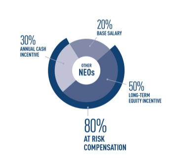
My company would love this chart. Specifically, the ability to have the outer ring.
 1
1
Stacked Waterfall Charts please!
I believe someone had already mentioned it- it would be extremely useful for various presentations we create.
Thanks,
Keisi
1
We have a similar chart that would be great to be able to do in workiva.
 0
0
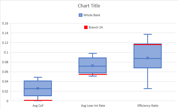
We would like to use box plots to do branch analysis. Each box would be a specific metric, with the population being all locations, then having the red line as an indicator for how the specific location compares. Included an image with random values
 0
0
Is the creation of Stacked Area charts in current planned development?
0
Hello is there an update on this topoc I was looking for a 100% bar and Column chart option.
Thank you.0
Hi Michael and Matthew,
These still remain proposed with our product team. I will get you both added to stay updated on future changes.0


Commenti
64 commenti