Scatter and bubble charts display two or more data dimensions simultaneously. Scatter and bubble charts are often used to communicate data related to risk management, audit and SOX processes.
Scatter and bubble charts can be used to help to identify correlations between two variables. This can help identify the potential root cause of problems.
Scatter charts
A scatter chart is a plot of individual points that display the relationship between two sets of data. This shows a trend rather than a direct correlation.
An example in business could be unit sales versus revenue. The two categories of information will set the location of the point. The color of the point can represent another factor such as production location. The size could be sales variance or the difference between the projected or budgeted sales and actual sales.
Bubble charts
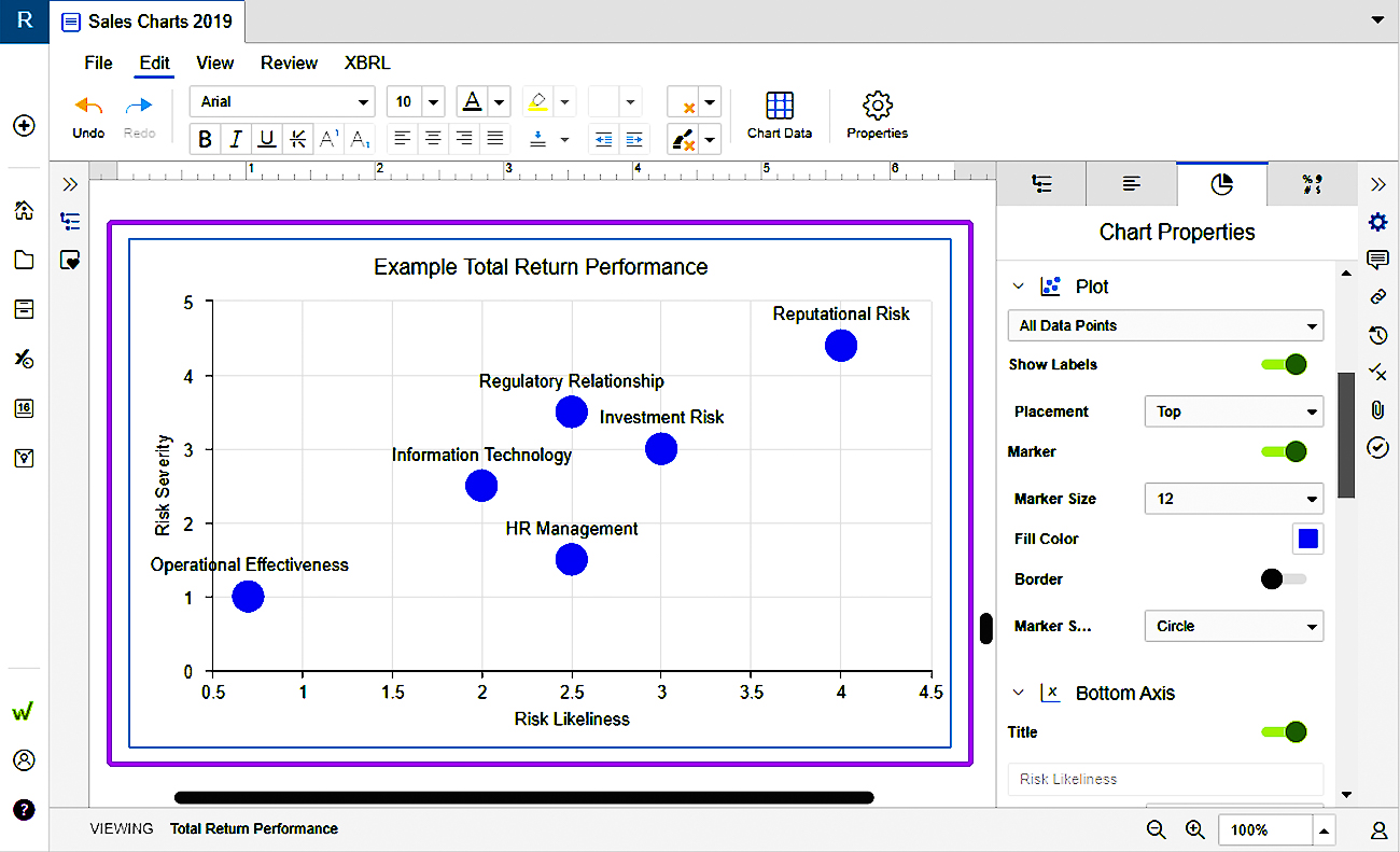
A bubble chart is a scatter chart with the addition of size data for the points depicted. Dimensions for bubble charts include the point label, the X axis position, the Y axis position and point sizes.
Bubble charts allow you to adjust the relative size and shape of the bubbles using the values in the data table or another linked source. In addition to X and Y axis points, you can add an additional column to your data table to set bubble size. Changing the range will then scale bubble sizes up and down as desired.
The following are example data parameters that could be depicted in a bubble chart:
- Point Label - Risk or Process Name
- X-Axis - Risk Likeliness
- Y-Axis - Risk Severity
- Size - Speed of Onset

Advanced bubble charts
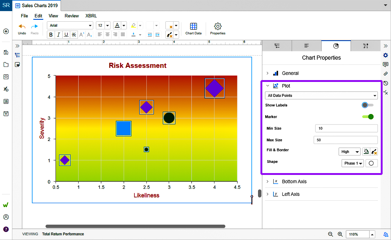
Advanced bubble charts add additional dimensions through shapes, colors and chart gradients.
The following are example data parameters that could be depicted in an advanced bubble chart:
- Point Label - Risk or Process Name
- X-Axis - Risk Likeliness
- Y-Axis - Risk Severity
- Size - Speed of Onset
- Color - Audit Phase (to compare how points move over time)
- Gradient - Shows general trend
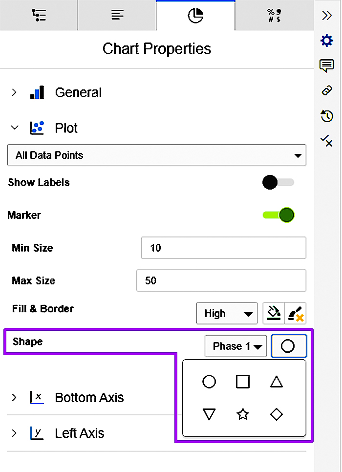
All of these dimensions can be controlled from the chart’s data table and the Chart Properties panel. For example, use the Shape drop-down setting in the Chart Properties panel to choose between shape options. Label formatting for the chart is controlled from the data table.